
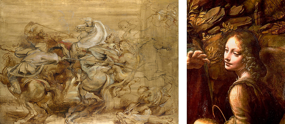
Above top: Paul Baldassini “Pansy Party”, 2023 underpainting; bottom left: Peter Paul Rubens “The Lion Hunt”, 1621; right Leonardo DaVinci detail from “Virgin of the Rocks”. 1483-1486.
NOTE: This post was prepared and edited from a monograph I wrote more than 10 years ago. -P
There are a variety of ways to approach creating a realistic oil painting, none of which is better or more correct than any other. Whatever approach you take will, to some extent, be influenced by your painting style and personality.
I paint to bring beauty into the world and to bring that beauty into people’s lives. By painting flowers larger than life, I use the power of scale to draw attention to special things that often go unnoticed – beauty easily ignored. And, even though I only paint in the genre of Florals & Gardens using oil paint, artists using any media to paint any subject matter in any style can benefit from the content I’ve illuminated in this book. Painting is hard work, and for most artists accomplished alone, usually in a small home studio or outdoors with portable equipment. Like any manufacturing process, there is a logical series of steps that, if implemented correctly, results in a quality product exhibiting longevity, durability and ownership satisfaction. Often, buyers return to their “brand” for more. So it is with paintings – with proper representation, marketing, and perception of the artist’s recognizable “brand” over time. Indeed, art museums and galleries across the globe are full of such work. Many, but not all, have withstood the ravages of time – atmosphere, light, environmental pollutants, and other damaging and harmful conditions – for over a thousand years because the artists and craftsmen who created them cared enough about their materials and working methods to insure generations of viewing pleasure with virtually little or no maintenance. I feel that way about the materials and techniques I use to create a painting and hope that you will also.
Since I like painting in a structured, organized manner, it was necessary for to me spend time studying the techniques of the Old Masters, rather than say, the techniques of 20th century modern masters, who I also admire. Over the years I experimented with all four of the historical approaches to realistic oil painting. But it was in the techniques of the 16th and 17th century Italian and Dutch master painters that I found comfort, relief and possibilities. After many years of study I realized that the main difference between 16th and 17th century Italian and Dutch and modern painting techniques is directly related to the magic mediums they used, whatever they were, AND how they broke down their working procedure into a series of distinct passages executed in a predefined order.
The most important of those passages is what is commonly and broadly referred to as the underpainting. Simply put, an underpainting is a monochrome version of the final painting intended to establish the composition, give volume and substance to the forms, and distribute darks and lights in order to create the effect of illumination. Since I am a realist painter concerned with light effects, the underpainting technique greatly facilitates both the realization of a compelling composition and accurate depictions of light and chromatic subtleties – the design and composition are completed well in advance of the overpainting.
My technique is very similar to that of the old masters, yet incorporates a modern feel with a contemporary style. This style developed over many years of trial and error, mostly informed by an assiduous study of Italian and Dutch master painters. This included books and numerous visits to Europe to see the actual artworks as I was determined to understand how they created such luminous paintings. My “aha” moment came when I saw a showing of the works of Titian, Tintoretto and Veronese in 1990 at the Musée du Petit Palais in Paris, France and three years later at the Royal Museums of Fine Arts in Brussels, Belgium in 1993 where examples of lesser known works by Peter Paul Rubens and contemporaries were on display. These included some monumental paintings on stretched and braced linen canvas and small panel studies. I’ve always been fascinated by the overwhelming design and craftsmanship of Rubens’ art, whose compositions contain a great deal of energy, rhythm and bravura brushwork that surpassed even the most influential artists of his time. Rubens’ works were painted mostly on panels or immense linen canvases toned with a mid-toned yellowish color (Raw Sienna?), applied unevenly in diagonal strokes with a coarse bristle brush allowing some of the white ground to show through. Examples of Rubens’ underpainting style is illustrated above and in the detail below. On top there was no drawing that I could notice, and the compositions were sketched and blocked in with thin fluid paint, an umber or warm brown, almost like a watercolor. The painting proceeded from there with soft milky semi-transparent mid-tones, some chromatic body color and then lights built up thickly to cover the ground using smooth, long brush strokes and thin layering affects.The shadows were scumbled thinly over the brownish underpainting which was very visible in much of the completed work. Since I was painting only in watercolor at that time I thought his approach to oil painting was really interesting and very appealing – I just had to figure it all out, and adapt it into oil painting technique.

left: Detail from Peter Paul Rubens’ “A Lion Hunt”, National Gallery in London, painted in 1614-15. The artist’s bravua brushwork is evident in this masterfully executed underpainting. Note the use of opaque white passages for highlighting and complete absence of any underdrawing.
I thought, “What a great way to craft a painting!” I mean, painting is hard enough and there a lot of problems to solve so why make it harder on yourself by trying to solve every problem all at once. Just think of the problems you have to solve — design and composition, drawing, tonal values, color and color mixing, light effects, and many others. I think its easier to get the composition, value and tonal considerations out of the way first and then focus almost exclusively on color mixing, temperature, edges and light. Combine that with direct painting, a little glaze and scumble, and voilà! – luminous breathtaking work in a relatively short amount of time. I’m simplifying of course but you get the idea. Underpainting/overpainting was also a great recipe for atelier style production where various aspects of the painting could be handed off to master-trained assistants
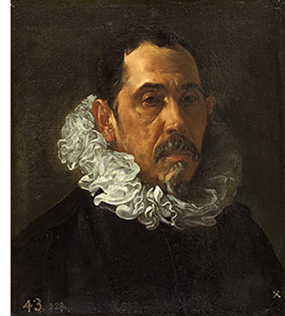
right: “Francisco Pacheco”, 1620-22. Oil on canvas, 41 x 36 inches by Diego Rodríguez de Silva y Velázquez (Spain). Although not much is known about Velázquez’s technique, it appears that Velázquez executed his works either directly on the dark ground of the canvas or on a thinly-applied sketchy underpainting tone on a dark ground using brown iron oxide (natural brown ocher). This classical technique for oil painting was used by Rembrandt, Carravagio, and others for strong chiaroscuro effects where the dark ground serves for shadows, other areas being built up as layers in varying degrees of fluid color and opaqueness. The collar was painted with soft, fluid brushstrokes using lead white, drawing our attention to the figure’s face.
As I studied more art at museums throughout Europe and the United States I discovered that nearly all, if not most, of the master Italian and Dutch painters were using some form of warm brown umber or gray underpainting completing their compositions with color overpainting treatments of various techniques. Paolo Veronese, for example, made fully realized tonal underpaintings, modeled the forms using white lead and raw or burnt umber, then glazed on color using paint and medium. Vermeer did the same style underpainting, but then laid in masses of translucent body color, blending with soft brushes, adding thick white lead highlights and darkening shadows as necessary. Anthony Van Dyck, a contemporary of Ruben’s, renown for his extraordinary detailed and glowing portraits, and sweeping landscapes, and fabrics featuring loose and fluid brush strokes were painted much in the same broad-handed manner as his master, but used a mid-tone gray ground instead of yellow. Like all of the painters working in this manner, the range of materials was not large, and the subtleties of color and color design relied on pigment mixtures with a magic medium and a systematic, multi-layered application of paint. This working method was standard in Antwerp and in the surrounding areas of the 17th century Low Countries of Europe and can also be seen in the works of Italian master painters as far back as the late 16th Century. The master painters have been utilizing the same basic underpainting technique, variations on magic mediums, and creating overpaintings to suit their own palettes and painting styles for centuries: Breugel, Leonardo, Pontormo, Fiorentino, Parmigianino, Bronzino, Manfredi, Titian, Caravaggio, Velazquez, Rembrandt, Janssens, Spranger, Hals, Snijders, Zurburan. The list includes many more. Thus began a 25 year investigation of the materials and methods used by these old master painters that has not quite yet ended.
My underpainting colors
There are many colors that can be used for a successful underpainting – its up to the individual painting style. The old masters made use available pigments of the day, mostly earth ochers and umbers. After years of experimentation I now use only two underpainting colors: Quinacridone Magenta, and Raw Umber. Both are lightfast, transparent, fast driers and offer a complete tonal range from very pale to rich and deep. Which color I use to create my underpainting is usually, but not always, determined by the subject matter.
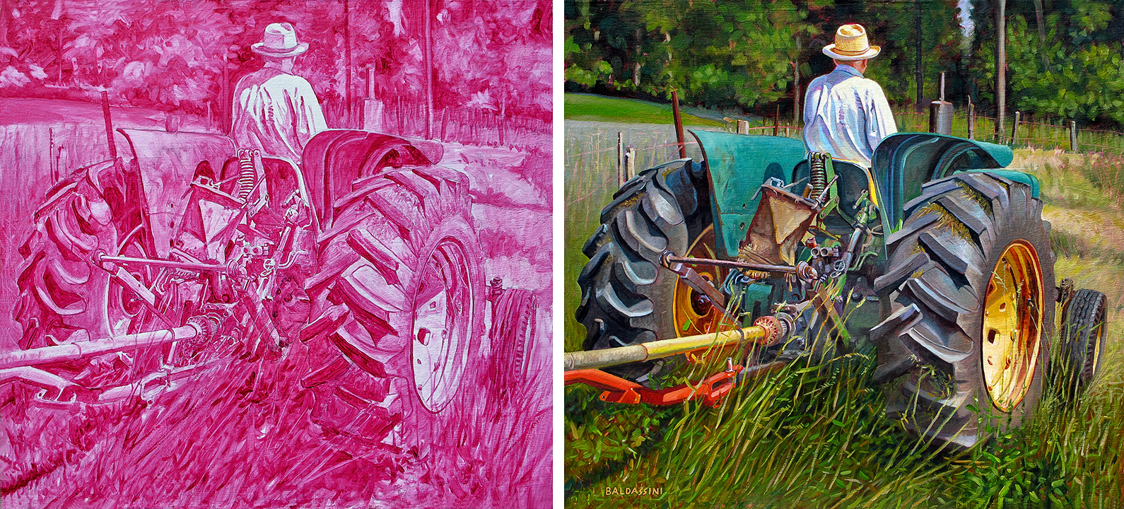
Underpainting in Quinacridone Magenta and completed “The Hay Tedder”, oil on mounted linen panel, 24 x 26 inches. This underpainting color is well suited for paintings that have areas of dominant greens, such as landscapes. Greens applied thinly in translucent and transparent layers over the background color vibrate as the magenta peeks through here and there.
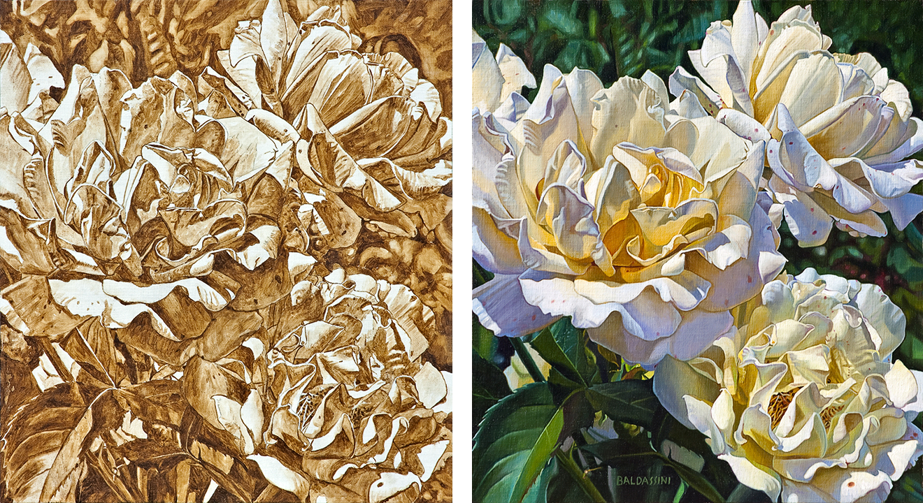
Underpainting in Raw Umber and completed “Three Red-speckled White & Yellow Roses”, oil on mounted linen panel 24 x 26 in Raw Umber. This underpainting color is well suited for just about any subject matter, but I always use it where yellow and white subject matter dominate. A variety of contrasting elements provide visual interest in a painting. Dark thinly applied transparent shadow colors contrast against more opaque purposefully painted body colors, allowing the warm background umber to show through revealing the loosely executed underpainting.
For example, for a landscape that has dominant greens, and most floral subject matter, I always utilize a magenta underpainting. A variety of thin translucent milky green glazes or “velaturas” applied over a magenta underpainting makes the greens in a landscape really vibrate as pink shades peek through here and there. A floral composition with dominant pink, red or purplish blossoms can be completed effectively and convincingly with the same kind of thin and thicker paint application and brushwork to model the petals which lets some of the magenta underpainting peek through. Where white or yellow blossoms, or even the blues of hydrangeas dominate, I would almost always use raw umber and overpaint accordingly. The browns of the raw umber underpainting produce an overall warmish tone and serve to facilitate and enhance shadow treatments. The luminous optical effect of the light entering the paint film, reaching the white ground and bouncing back through the translucent layers to the viewer’s eyes is sublime.
There are added bonuses: the underpainting unifies the colors, most of which can be applied very thinly, especially in the shadows, followed by translucent mid-tones, with only the more opaque highlights applied thicker. And, it doesn’t take much material to create a painting in this manner, so there are economical benefits also: since less paint is used to create a work the savings can be used to purchase paint manufactured from higher quality and/or more desirable pigments.
4 Responses
Greetings! Very helpful advice within this article!
It is the little changes which will make the largest
changes. Thanks for sharing!
Thank you Steve. -P
Great site, informative blog!
Thank you very much for your generous comments Louise. I will continue to keep writing. -P