
Peter Paul Rubens, Samson and Delilah, 1609-10, oil on wood 6 ft. × 6.75 ft, National Gallery, London. This large masterpiece depicts the biblical story of how Delilah deceived her lover Samson, who though possessing immense strength, was lulled by Delilah into telling her his secret: his strength was given to him by God under the condition that he let his hair grow. A man in the painting is just about to cut Samson’s hair and his enemies – the Philistines – are already waiting at the door to seize him. Rubens was 23 and already listed as a Master Painter by the Guild of St. Luke in Antwerp, when he travelled to Italy remaing there for eight years, assimilating the work of Titian, Raphael, Da Vinci, Michelangelo, and most significantly Caravaggio, an artist who painted nothing but drop-dead masterpieces, who was still alive when Rubens arrived in Italy in 1600, and died, on the run, in 1610, two years after Rubens went back to Antwerp. Rubens had seen Caravaggio’s experiments in the use of highly contrasting light and shade, and deep, rich color. His meditations on Caravaggio led him to paint his own most tragic and finished masterpieces, of which Samson and Delilah is a most notable example, commissioned by his friend and patron, Nicolaas II Rockox, the mayor of Antwerp, for his private collection.
Peter Paul Rubens (1577-1640), Antwerp, Netherlands, sought to achieve the same results as Titian, but sought to do it using the “alla prima” (at once) method of painting – getting the whole thing done in one complete and continuous operation.
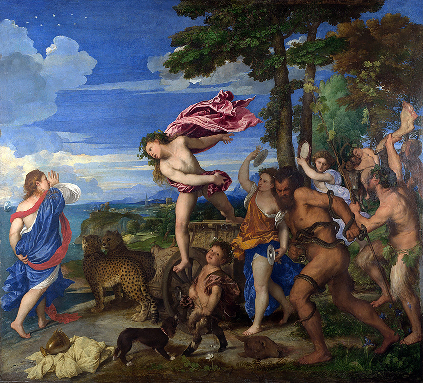
Titian, Bacchus and Ariadne, oil on canvas, ca 1520-1523, 5.75 ft. x 6.25 ft, National Gallery. London. The vibrant colors and striking contrasts, coupled with the dynamic arrangement of figures is a masterpiece of the High Renaissance. Titian’s command over composition and use of color are hallmarks of a period that blends realistic human emotion and anatomical correctness with an idealized beauty. The background showcases a serene landscape that seemingly contrasts the primary scene, creating a balance between the human figures and nature. Titian’s paint surface is characterized by loose, colorful brushwork and the dragging and smudging of the paint over the canvas creates vibrant, nuanced effects that animate the emotionally charged scene. Although appearing chaotic, the image is well composed consisting of two diagonals running towards Ariadne on the left. At the bottom left of the picture, in the overturned goblet, Titian, the most important Venetian painter of his time, has hidden his signature.
No. 3: Highlighting with impasto white. Tiziano Vecelli or Titian, the preeminent and influential Venetian painter (1485 -1576) developed a new way working with the revolutionary van Eyck oil medium. Whereas the northern master’s techniques were suitable for smaller panel paintings, their highly lustrous and reflective surfaces posed problems for the southern European painters, and did not suit the needs for larger mural-style works that needed to be painted on linen canvas supports. Titian’s technique, briefly, was to start off with a reddish-dark brown earth background, slowly building up the layers by creating a underpainting grisaille in white and gray and finishing in opaque layers with full color translucent and colorful glazing.
Titian discovered a medium that allowed a freer painting style that facilitated larger formats, combined with an ease of blending and would work on any support with or without any preliminary drawing. In this way, Titian was able to create, for the first time, a soft smokelike blending of edges into background passages, called sfumato. This invested the composition with an airy feeling flowing over the surface of the work, harmonizing edges into the background. Due to the addition of beeswax into his oil medium, possibly a black oil mixture of some kind, the matte finish of his work mitigated the objectionable reflective surface typical of the northern European masters. The new medium was also slow-drying, allowing the artist to easily cover, blend and modify large passages while still wet and tacky over a lengthy painting session.
Orpheus Enchanting the Animals (painted as early as 1614, latest date 1648) attributed to Alessandro Varotari (known as Padovanino) a minor north Italian artist from Titian’s workshop—or even possibly partly by the master. The warm orange-brown underpainting is both visible and fully integrated into the composition. Notable is how the expert handling of paint animates the voluptuous form of the figure. With the lightest touch, the painter applied loose scumbles of lead white (thin, opaque paint layers that give a dull or sketchy effect) and warm pinks to certain areas of the torso contrasted with the cooler greenish verdaccio. Surrounding the figure Varotari (or Titian) left a reserve of barely covered ground layer, transforming this void into a scene of landscape and anmimals.
In this technique the artist tones the surface with a thin reddish-brown middle or darker value layer. This layer is called an imprimatura and it literally means first paint layer in Italian. He then creates an underdrawing serving only as rough guide, which might then be disregarded during the development of a painting. On top of the underdrawing Titian would directly “sketch” over the image using a small brush and thinned paint, restating the linework as necessary to refine the composition. The artist would then commence with a completely modeled white and gray-toned underpainting of the figures, sometimes using very thick impastos; other objects to be painted lighter would also be underpainted in white, though not as thickly painted or modeled to the degree of finish as the figures. The lead whites, once dry, would then be painted over with translucent veils of color, called velaturas, and transparent glazes, softly blending into darker glazed passages. Directly painted passages of colors mixed with white and or opaque colors were used for other elements throughout the composition harmoniously unified into the painting surface through the use of his “magic” medium.
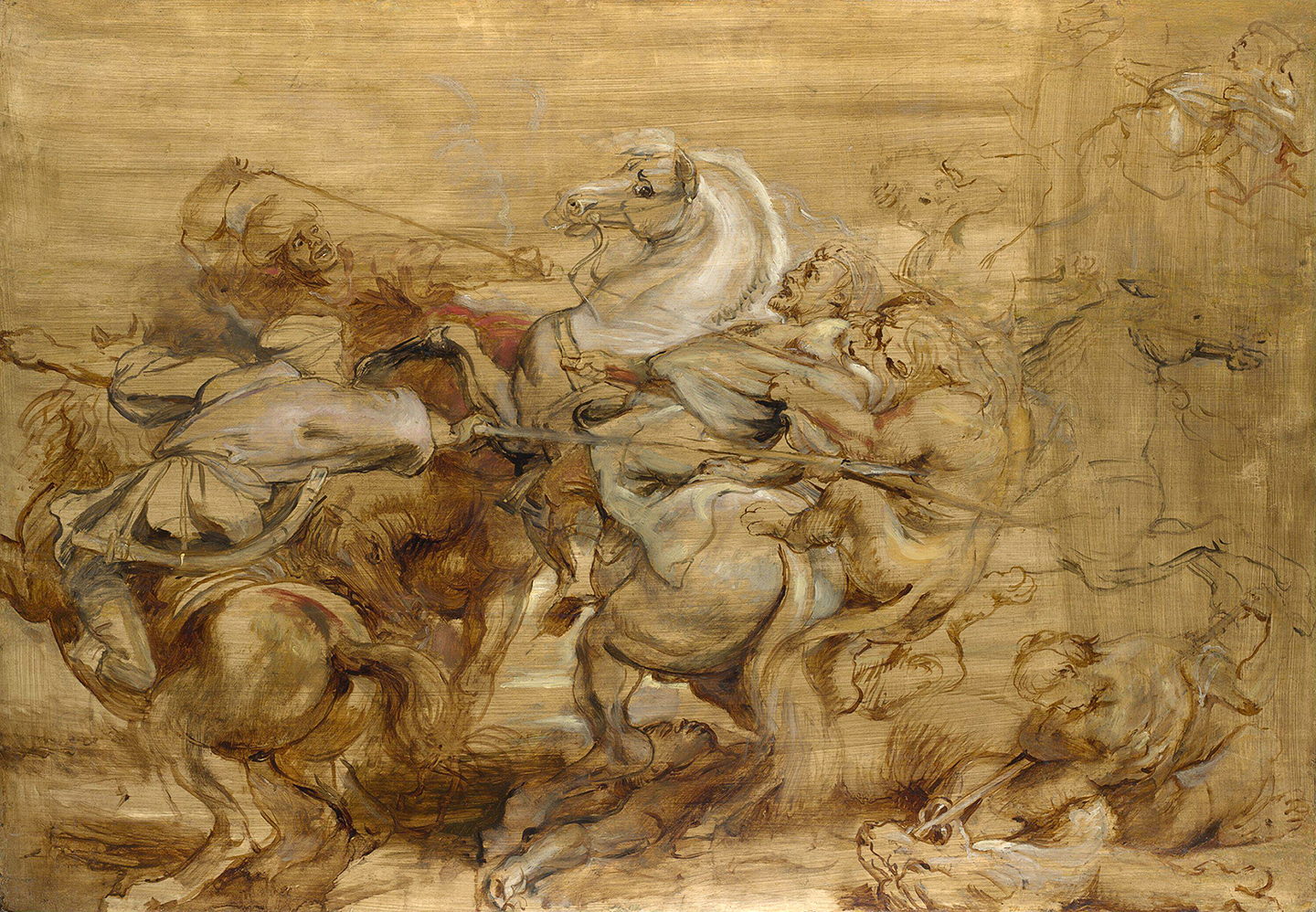
left: Peter Paul Rubens, A Lion Hunt, 29 x 41.5 inches, 1614-15, oil on oak panels. National Gallery in London. Confident, bravura brushwork and use of opaque white passages for highlighting are key aspects of Rubens’ signature technque. In this modello, or sketch, the striated application of the dark earth yellow impimatura is evident in this large complex work. There appears to be no drawing, the composition confidently sketched and blocked in with thin fluid paint, an umber or warm brown, almost like a watercolor. The painting proceeded from there with soft milky semi-transparent mid-tones, some chromatic body color and then lights built up thickly to cover the ground using smooth, long brush strokes and thin layering affects.The shadows were scumbled thinly over the brownish underpainting which was very visible in much of the completed work.
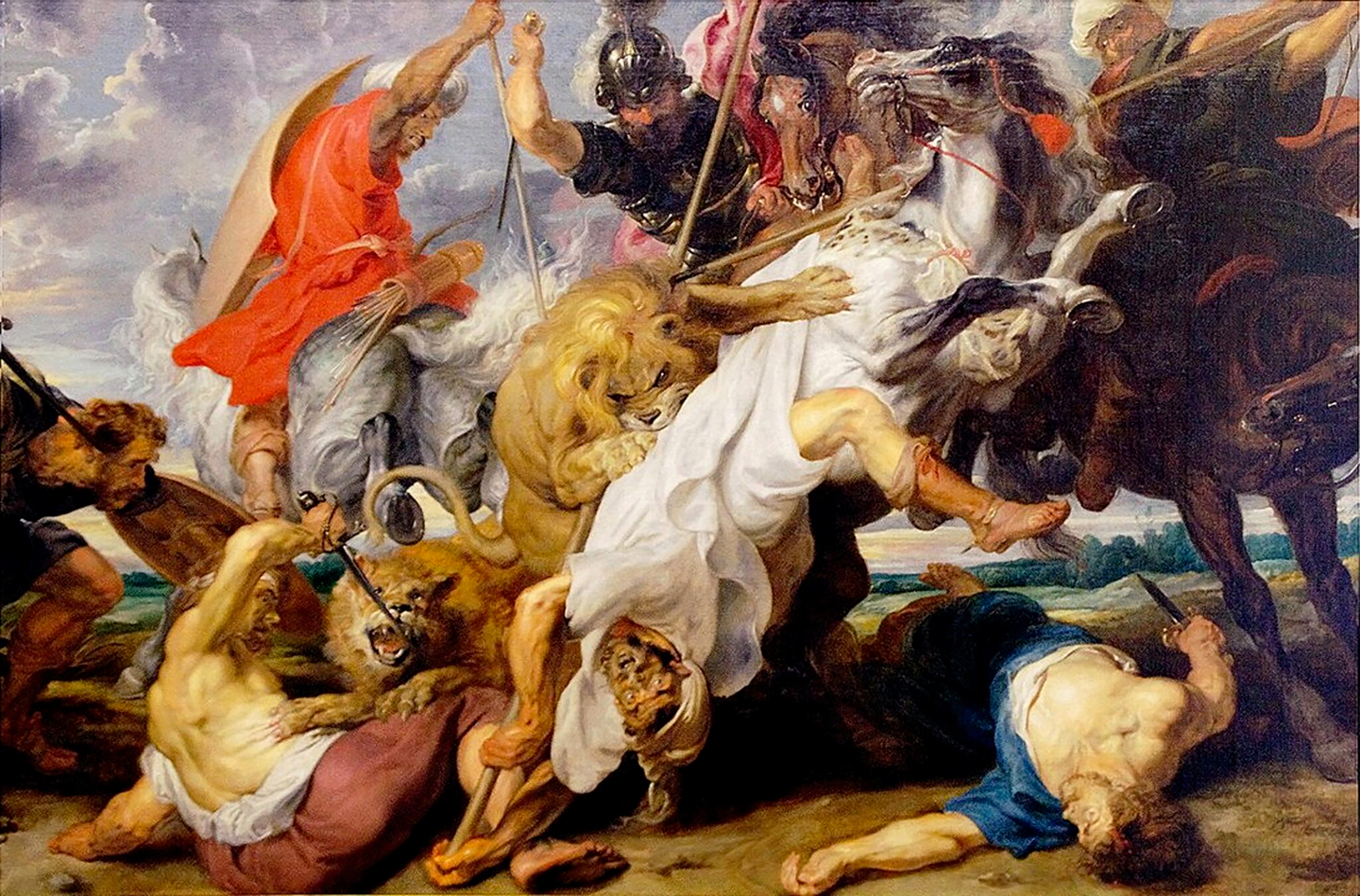
right: Peter Paul Rubens The Lion Hunt 148 x 98 inches,1616 oil on linen, Alte Pinakothek, Munich, Germany. This immense iconic painting, fully realized in glorious color and based on the smaller loose oil sketch, is teeming with muscular figures, fierce beasts, and frenzied motion stands as a masterpiece of Baroque dynamism and dramatic tension. It is a densely layered work rich in allegory, technique, and cultural resonance, representing Rubens’ exploration into the themes of man’s struggle with nature, human valor, and the sublime chaos of life and death. Ruben’s actual oil painting technique has long been a contentious subject of art historians and academic analysis. It does appear however that the artist used “oil of turpentine”, distilled from pine resin, to reduce the viscosity of his paints for application in thin translucent layers, some having been brushed wet-in-wet. Highlights, such as those on flesh, and white fabrics, have been added last, using more viscous paint wet-on-dry. Rubens normally used a neutral yellowish grey or or raw sienna/yellow ochre mid-tone imprimatura over the ground, on top of which the underdrawing would be worked up from an earlier oil sketch or study. Less saturated colours would then be used to develop the dead colouring, onto which he would add key highlights and brights. Upper layers of paint were applied using a rich variety of techniques, including milky transparent layers of color (velaturas), using paint which ranged from the thin (diluted using turpentine) to the buttery, sometimes stiff. His paint was stiffened by boiling the oil down or possibly by adding small amounts of egg white, seldom by using resins, and was applied most commonly in highlights, where his brushmarks remain apparent. Dark passages were painted with thinly applied transparent paint, allowing much of the reddish-brown underpainting to remain visible.
Peter Paul Rubens assimilated the works of both Titian and the German artist Albrecht Dürer, (1471-1528), who was credited with introducing the classical motifs of the Italian Renaissance into Northern Europe and seminal in his adoption and technique of using the luminous transparent oil colors of the Flemish masters. Rubens brilliantly synthesized a combination of Dürer’s more controlled Flemish style and Titian’s broad expansive style. Rubens worked on both smaller wooden panels that were most likely painted from his own hand from start to finish, and immense commissioned linen canvases, for which he would complete the underpainting and much of the overpainting but delegate specific details to atelier assistants. I have stood agape many times in front of Rubens’ small and large work in museums in both the United States and in Europe, marveling at the artist’s supremely confident bravura brushwork that was his unique painting style.
Rubens’ technique was to paint over the surface of his white ground with a large brush applying a very thin mid-tone yellowish brown imprimatura in long uneven striated diagonal strokes, leaving the ground showing through here and there. On top of that he executed an underpainting of instinctive and loosely controlled washes with thin fluid paint, either in a warm brown umber, or perhaps a fast-drying distemper (an emulsion of egg yolk, oil and water), no one really knows for sure. The areas of the composition to be highlighted were then painted on top with a heavy impasto white lead paint. To create the top layers in his signature style Rubens needed a medium that did not produce a matte finish as in the Italian style (Titian added beeswax), but one that would provide a glowing luminosity to his translucent velaturas and transparent glazes. This wonderful combination of imprimatura, underpainting, translucent and transparent passages over opaque passages of white paint was sublime. Rubens work was a masterfully manipulated exercise in contrast: light against dark, thin passages of paint against thick more opaque passages, forceful brushstrokes against soft sfumato blending, transparent warm glazes against cooler modeled veils of color. The luminous image develops in loosely painted, dark washes, often barely concealing the underpainting below, where contours and edges do not require a high degree of definition. The result is often a deliberate extreme chiaroscuro effect resulting in a very dramatic presentation of the subject, like Samson and Delilah for example, at the National Gallery in London, painted in 1610.
Rubens found a medium that allowed his paint to remain luminous and workable for many hours. His magic medium and working method allowed a high degree of interaction and control between the current layer and the one below it, much like the layers and layer modes in Photoshop, to use a very modern analogy. Although there’s no way to know, unless you could go back in time and look over his shoulder as he worked, its quite possible that his paint was mixed with a thick, transparent jelly medium containing black oil, making his colors rich and luminous, and no wax. Or maybe not, as others claim he used a congealed coniferous oil-based varnish, and still others say he used simple nut oil and turpentine mixtures. Whatever it was, its handling characteristics were such that it could be brushed on thinly with a large brush, covering a large passage quickly, but thick enough so that the paint would not run and he could drag a small brush through it without drying or getting tacky. This technique allowed Rubens to paint rapidly and complete his works in record time. This might explain, perhaps in part, his prodigious output. Indeed, Rubens technique was one of the most efficient techniques in the history of art. A prolific artist, Rubens (and his atelier) produced over 1,400 significant works of art during a roughly 30 year period until his death in 1640.
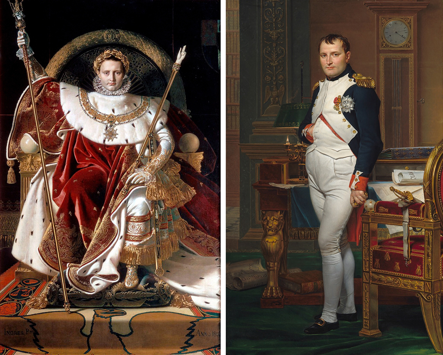
top left: Napoleon on the Throne or His Majesty the Emperor of France on his Throne, Jean-Auguste-Dominique Ingres, 1806, 5.375 ft. x 8.5 ft., The Musée de l’Armée, Paris. Napoleon Bonaparte was named emperor of France after the senatus consultum of May 1, 1804 and a sumptuous coronation ceremony took place a few months later, December 2, 1804, at Notre Dame Cathedral in Paris. For the occasion, Napoleon wore a range of different garments, including the “grand habillement” (ceremonial dress). In 1806, the 26-year old Ingres painted him wearing this ceremonial dress, including a purple velvet robe decorated with golden bees. A striking and unmistakable effect of the geometry of the elements around Napoleon’s head is the extraordinary halo-like effect. This compositional strategy, combined with a pictorial space represented with almost no depth, and looking like an overexposed photograph, is highly reminiscent of Jan van Eyck’s depiction of the enthroned “God the Father” in the central panel of his Ghent Altarpiece.
top right: Jacques-Louis David – The Emperor Napoleon in His Study at the Tuileries, 1812, oil on canvas, 6 ft. 8 in. x 4 ft, National Gallery of Art West Building, Washington, D.C. Six years after Ingres’ Napoleon, Jacques-Louis David, Ingres’ teacher aged 64, painted his portrait of The Emperor Napoleon. Like Rubens before him David’s personal artistic style developed from years spent studying in Italy. In a turbulent and overwrought period of history, David’s paintings, like those of Ingres, are solemn by contrast, capturing and allegorizing the ideals, luminaries, and events of the period with cool austerity and grandeur. Both artists made use of aggrandizing imagery to improve an audience’s perceptions of the subject, a tactic still very much in use today, both in advertising and in the propaganda and portrayal of leaders and rulers. And, both artists have come to embody the rise of neoclassical art with precise drawing, sophisticated design and geometry, meticulous application and handling of paint, grounded in an emulation of the clean lines of ancient sculpture, and rejecting the fantastical and decorative rococo style that came to symbolize the excess of the French monarchy.
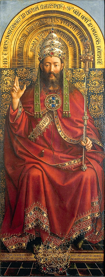
left: The Ghent Altarpiece detail God the Almighty, Jan and Hubert van Eyck, 1432. Oil paint, tempera, wood panels, 11 ft. 6 inches x 15 ft. The work is a very large and complex 15th-century polyptych altarpiece in St Bavo’s Cathedral, Ghent, Belgium. Art history repeats itself in Ingres’ painting as Napoleon sits on an imposing, round-backed and gilded throne, one that is similar to the one that God sits upon in the van Eyck brother’s Flemish masterwork. Also notably similar is the meticulous level of layered detail, especially in the brocade fabrics, throughout all aspects of the work.
No. 4: Direct painting and surface blending. In the last of the four classic techniques of realistic oil painting, the artist mixes both individual colors and values on his palette, where they are carefully applied and blended on the surface with gradual transitions from highlight to shadow. This technique favors smoothly modeled gradations with no visible brush marks, as each successive layer of paint is applied and carefully blended into the surrounding paint. Unlike the technique of Rubens, the underpainting serves no purpose other than as a guide for the painting on top and never interacts with the surface layer. Examples of this style of oil painting can be seen in the formalized portraits of the Neoclassicist artists such as Jacques-Louis David and Jean-Auguste-Dominique Ingres, both of whom were greatly inspired by classical images of Rome and its power, and superb draftsman, insisting on the importance of line and brilliant mastery of color. The resulting paintings appear much calmer, the technique one of controlled smoothness and detail with no abrupt shifts or contrasts and with no underdrawing or underpainting visible through each paint layer.
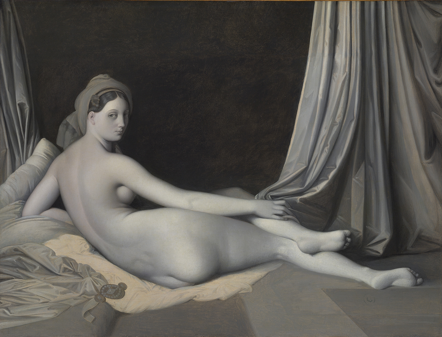
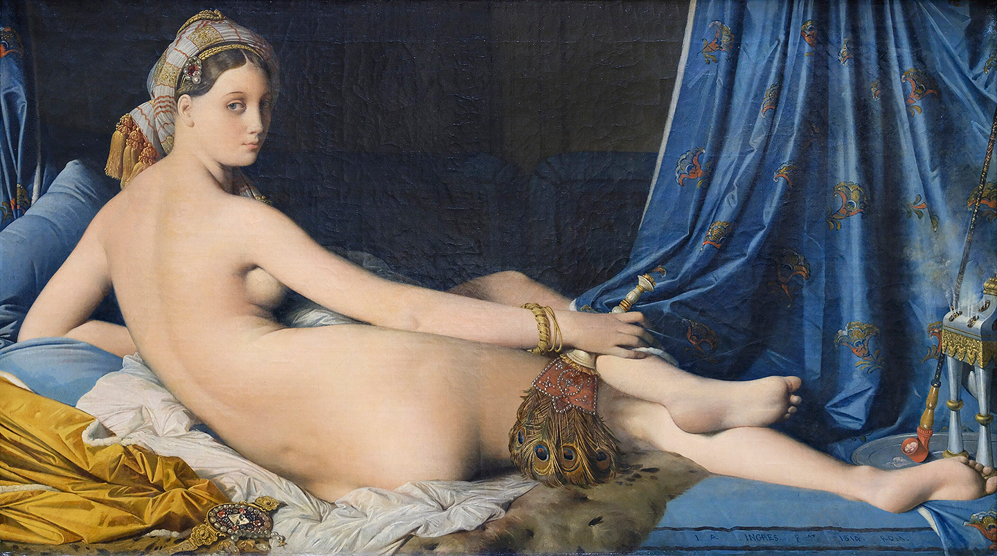
left: Jean Auguste Dominique Ingres, Odalisque in Grisaille 1824–34, oil on canvas 32 3/4 x 43 inches, The Metropolitan Museum of Art, NYC. right: Grand Odalisque, 1814, oil on canvas, 35 × 64 inches, Louvre, Paris.
The last of the four technique favors smoothly modeled gradations with no visible brush marks, as each successive layer of paint is applied and carefully blended into the surrounding paint. Unlike the restless technique of Rubens and his contemporaries, the underpainting serves no purpose other than as a guide for the painting on top and never interacts with the surface layer. The Neoclassicist artist Jean-Auguste-Dominique Ingres was greatly inspired by classical images of Rome and its power, and was a superb draftsman, insisting on the importance of line and brilliant mastery of color. The resulting paintings appear much calmer, the technique one of controlled smoothness and detail with no abrupt shifts or contrasts and with no underdrawing or underpainting visible through each paint layer. Ingres painted two version of the Odalisque, on the left is the grisaille version with a perfectly painted monochromatic grisaille, on the right is the full-color work. Notice how calm and unclutterd the light passages appear with no obvious brushstrokes to clutter up his forms. The overall feeling is one of austere refined beauty – a classical sheer perfection and purity of vision.
To sum up, the 15th century master painters were concerned with using glues, temperas and some oil, and with manipulating the effects of light and shade to communicate a sense of “reality” to the viewer. The compressed space of sacred backgrounds were replaced with earthly settings evincing the illusion of depth mindful of symbolism and meaning. Brushstrokes of light and shade were used to draw attention to the realness of the human form by emphasizing bodily curves, bulk and muscles.
In 16th century Renaissance Italy the ability to invent, or create, put the artist on a footing with God, the ultimate Creator, and was a means of raising the status of painting from craft to art. A dispute arose between those artists who chose to imitate Nature (“Colore”, ie Titian in the north) and those who chose the Antique (“Disegno”, ie Raphael in central Italy) as their model. For the nothern painters, not only was the new oil medium more durable, but it allowed painters to fully explore the stylistic possibilities of oils, in particular rich colors and naturalistic effects of light, for which the Venetian painters were enamored. For the central Italian artists, drawing was a key activity of their training and practice, and good draftsmanship was regarded as a prerequisite for good painting. Particularly in Florence, drawing was regarded as the unifying practice of all the arts, embodying the fundamental concept of design (Disegno in Italian means both drawing and design, and bears a more complex meaning in art, involving both the ability to make the drawing and the intellectual capacity to invent the design). Because of this, Florence had a reputation for producing “universal” artists – those who had mastered multiple disciplines – science, painting, sculpture, and architecture, such as Michelangelo, DaVinci, Raphel and Bramante.
By the 17th century academies (artist-run organizations whose aim was to improve the professional standing of artists as well as to provide teaching) were widespread in Europe where this dichotomy would be reduced and magnified by two groups of artists. 1: Those who were more strongly influenced by Raphael and the Antique and who painted with a smoother, apparently more refined and finished technique; and 2: those who were more influenced by Titian and the Venetian school of painting (as well as Rubens and contemporaries in the Low Countries, coastal region of northwestern Europe), who developed a sketchy shorthand style in which the properties of their painting materials were exploited to evocative effect. Thinly applied grounds and spare applications of underpaint allowed the panels themselves to play a role in the image. Underdrawings became quick notations upon which a more complete painted “sketch” was developed, and this monochrome image, only partially colored and worked up in the final stage of painting, was a dominant part of the finished work.
Many art epochs prevailed in the 18th century, some of which came from the previous century, or developed and evolved such as Baroque, Rococo, Classicism and Romanticism, where the two aforementioned tendencies have been seen to coexist through the end of the nineteenth century. In addition to David and Ingre, important painters of this period include William Hogarth, Jean-Antoine Watteau, Francisco Goya, Jean-Honoré Fragonard, François Boucher, Eugène Delacroix, Jean Siméon Chardin, and Giovanni Battista Tiepolo (who with Titian shared a jaw-dropping retrospective of works I attended at the Grand Palais, Paris in June, 1993). Female artists of note include portraitists Louise Elisabeth Vigee Le Brun and Rosalba Giovanna Carriera, figurative painter Angelica Kauffmann, and floral painter Mary Moser.
Although these two schools differed in their approaches to handling materials and paint, they both subscribed to the idea that painting should be the representation of natural appearances on a flat surface and most importantly, that through this representation the public should be able to grasp a higher and greater truth.